Design
Pantone colour of the year 2026: what Cloud Dancer means for interiors
“A whisper of tranquility and peace in a noisy world” is how Pantone described Cloud Dancer, their Colour of the Year for 2026.
A soft, creamy white shade, it represents calm, consideration, and comfort.
Pantone, one of the world’s leading colour experts, has released a colour of the year every year since 1999, attempting to capture not just trending colours, but encapsulate the cultural mood in a single shade.
At first glance, Cloud Dancer and its place as Colour of the Year may feel like a return to neutral tones, but its impact is far more nuanced. Rather than signalling a move away from colour, the desire for individuality, and self-expression in interiors, this choice speaks to how we’re using them differently.
Whether your style is clean and bright, warm and moody, or bold and joyful, white tones like Cloud Dancer are the thread that can tie your home décor together.
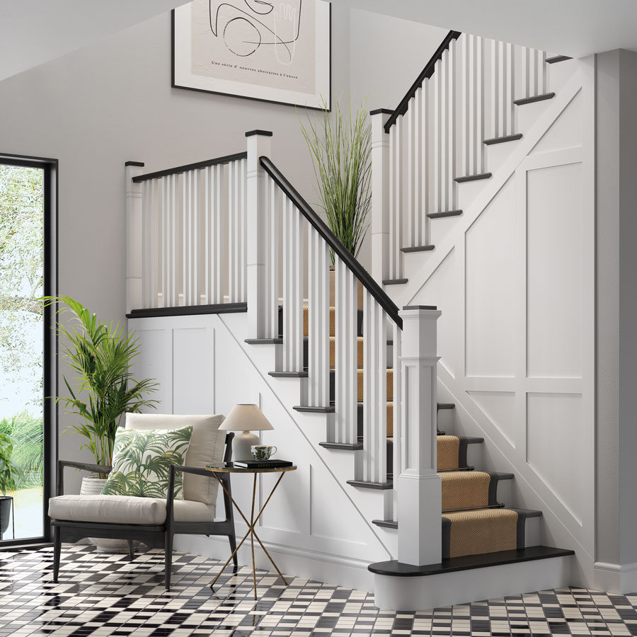
Contrast without Coldness
Black and white is still one of the most enduring combinations in interior design. The striking marriage between light and dark is its strength, but it’s important to strike the right balance. Too soft and muted, you lose that deep contrast. Too bright and stark, and the space can end up feeling cold.
In this painted staircase, our warm Sorrel White creates depth against cool Jacobean oak. The feeling is strong, architectural, and timeless, but opens the door to bring in pops of individuality, colour, and creativity.
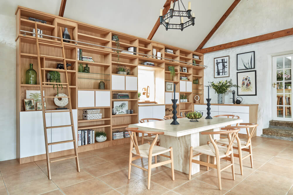
Back to Nature
Bright whites paired with natural materials create an environment that is light and warm, creating a space that is immediately grounding without feeling heavy.
Creamier than a true white yet fresher than traditional neutrals, Arctic White feels perfectly at home when combined with organic materials like terracotta, stone, marble, warm wood, rattan, and deep green glass and foliage, like this dining room and library project.
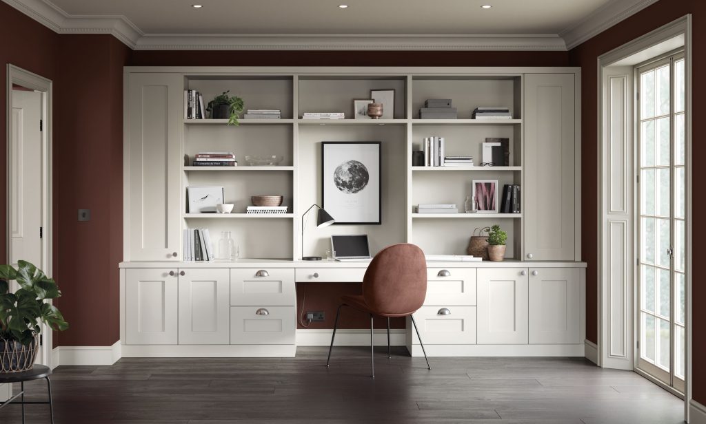
Bright Ideas
In a home office, being able to feel calm, collected, and creative is a must – and colour is one of the most impactful ways create that feeling in your space.
Soft whites effortlessly lift warm, cocooning spaces, allowing richer accent colours to feel energising rather than overwhelming.
In this home study, our Orchid white marries with a deep, burnt ochre. While the room itself feels cosy and comfortable, the light streaming in through the French windows bounces off the white cabinetry and shelving, illuminating the space and letting the rich burgundy tones really shine.
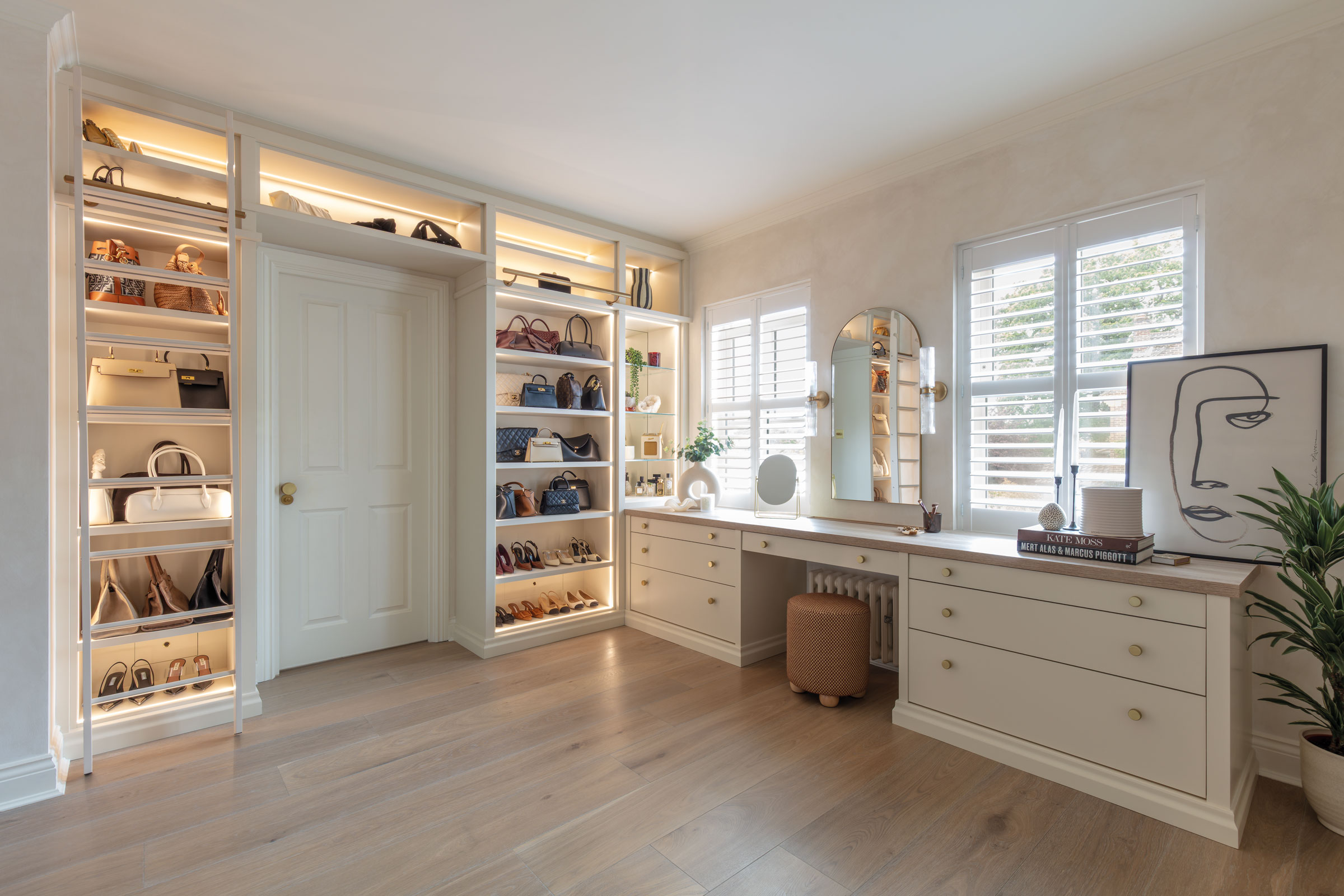
All White, Done Right
White on white interiors remain a classic choice, but not all whites are created equal. Warm, cool, true, blue – the options are endless and really do have a significant impact on the finished feel of a space.
In this dressing room, a soft, light-reflecting tone creates flattering natural light. In this space, our Mayflower white feels warm, private, and restorative, perfect for a sanctuary that is completely your own.
The New Language of Colour
As the Colour of the Year for 2026, Cloud Dancer offers a clean paint palette, and a way to temper bold spaces without muting their character.
While white interiors have always had a place in design, today’s whites feel more intentional. They’re layered, nuanced, and rich in undertone, chosen not simply for brightness but for how they interact with light, texture, and other colours to create spaces that don’t just look a certain way, but feel it too.
At Neville Johnson, we offer ten different white shades for all our furniture projects, so that whatever your style, we’ll bring to life a design that uses neutrals thoughtfully within your space.
Discover how we can transform your space by requesting a free design consultation today.